Three platforms, one calculator. The complexity lived underneath.
A modular sales-enablement tool for Unum HR Connect. Two deployment modes, three HRIS platforms, nine conditional paths. Designed so the user never had to see any of it.
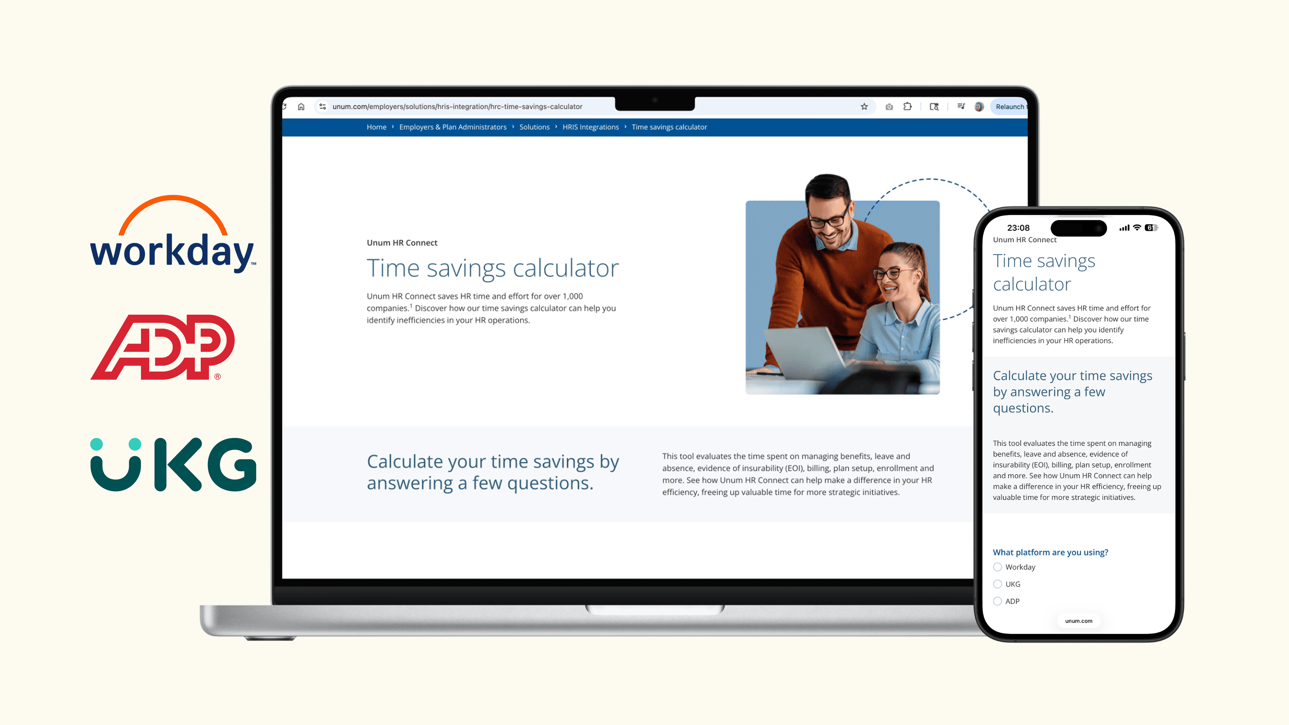
Inherited brief, shaped delivery
Workday, UKG, ADP customers
Salesforce on the back end
Design through post-launch fix
Sales had a value story they couldn't prove on paper.
HR Connect saved customers real time. The estimate varied wildly by platform. Prospects wanted a number tied to their company.
Unum's HR Connect product promised meaningful time savings to HR teams. But the actual hours saved varied dramatically depending on which HRIS platform a prospect was running. In late-stage deal conversations, prospects asked for a number tied to their own headcount and industry. Sales had anecdotes and ranges. Anecdotes don't close enterprise deals with data-driven HR buyers.
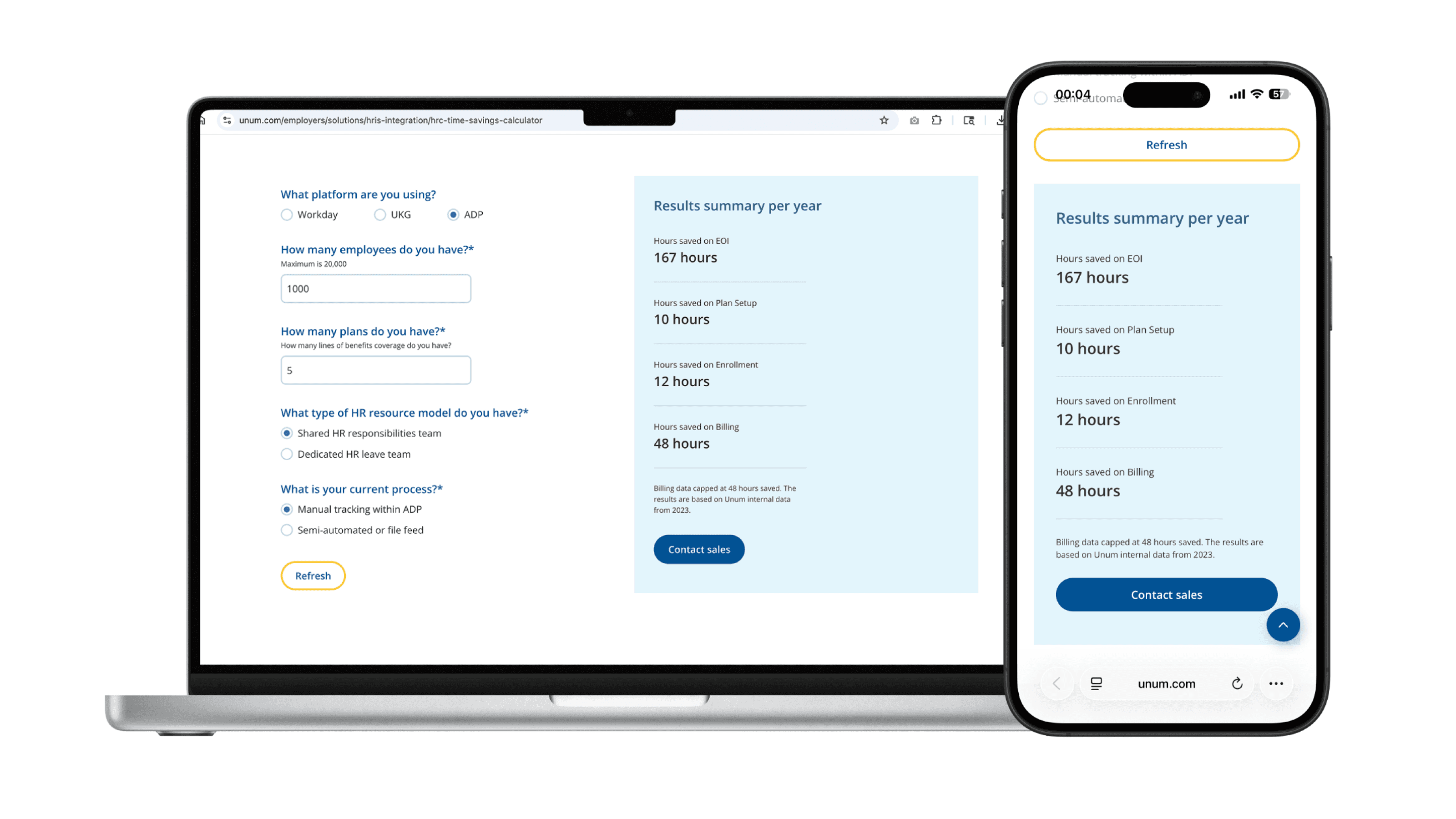
The brief I inherited asked for a public-facing calculator that could give that number live on the page, for any of three platforms, in two deployment contexts, without exposing a single dollar amount for compliance reasons.
"Express time savings only, no financial values. The calculator should be able to be positioned on any type of page as any other component would be."
— Project documentation, May 2024
Two sentences from the brief that quietly defined the architecture. No financial values meant compliance wrote the result language. Positioned on any type of page meant the component had to be modular enough for marketing to drop into any Sitecore page without engineering involvement.
Four constraints shaped every decision before I drew anything.
Constraints in this project came from four different directions: platform partnerships, compliance, marketing operations, and CMS. Each one ruled out certain design moves and pointed toward others. Together they made the architecture almost inevitable.
Three platforms, two input architectures
Workday and UKG share calculation logic. ADP needs entirely different inputs (number of plans, resource model, process type). The component had to switch between architectures invisibly based on a single upstream choice.
Hours only, never dollars
A deliberate compliance constraint. Every output framed in hours. Every result panel followed by editable attribution language ("Based on Unum internal data, book of business 2023") so legal could update copy without a new design cycle.
Gated and ungated, same shell
Lead-capture mode pipes inputs into Acoustic and over to Salesforce. Nurture mode just calculates. Same component, two conversion flows, no visible difference to the user. The form lived underneath, tracking selections invisibly.
CMS-modular, marketing-deployable
The calculator had to live as a Sitecore component marketing could drop into any page. Editable copy, editable links, editable attribution, configurable error messages. Every string was a CMS field, not a hardcoded value.
One question controlled everything else: "What platform are you using?"
Putting the platform selector first turned the hardest problem (three forms, three calculations, three result layouts) into a single decision gate. Everything downstream became a consequence of that one answer. A user filling out the calculator only sees the questions that matter for their platform, in the right order, with the right defaults. They never know the other two paths exist.
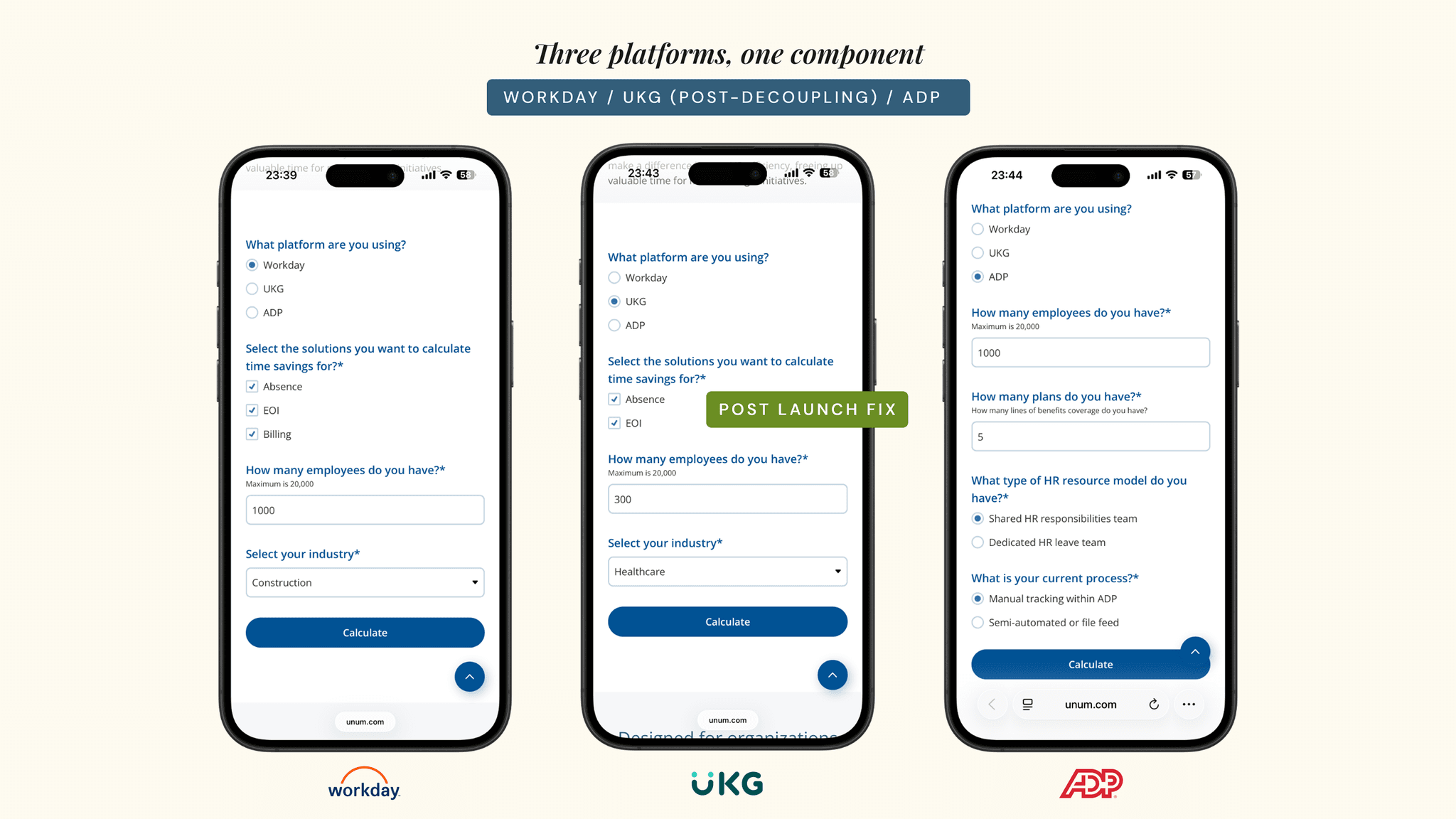
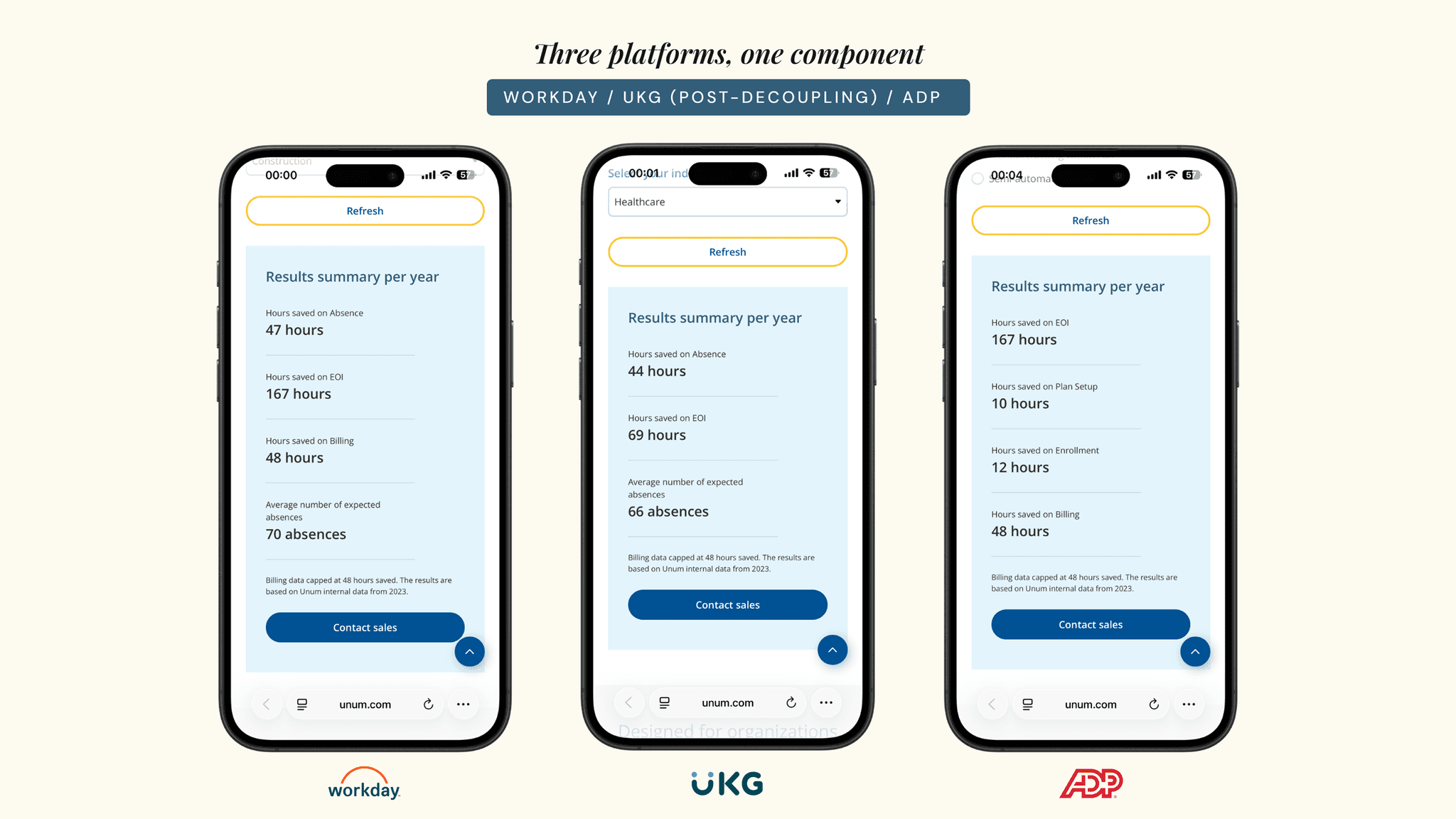
Annotated low-fi wireframes did more work than the high-fis ever could.
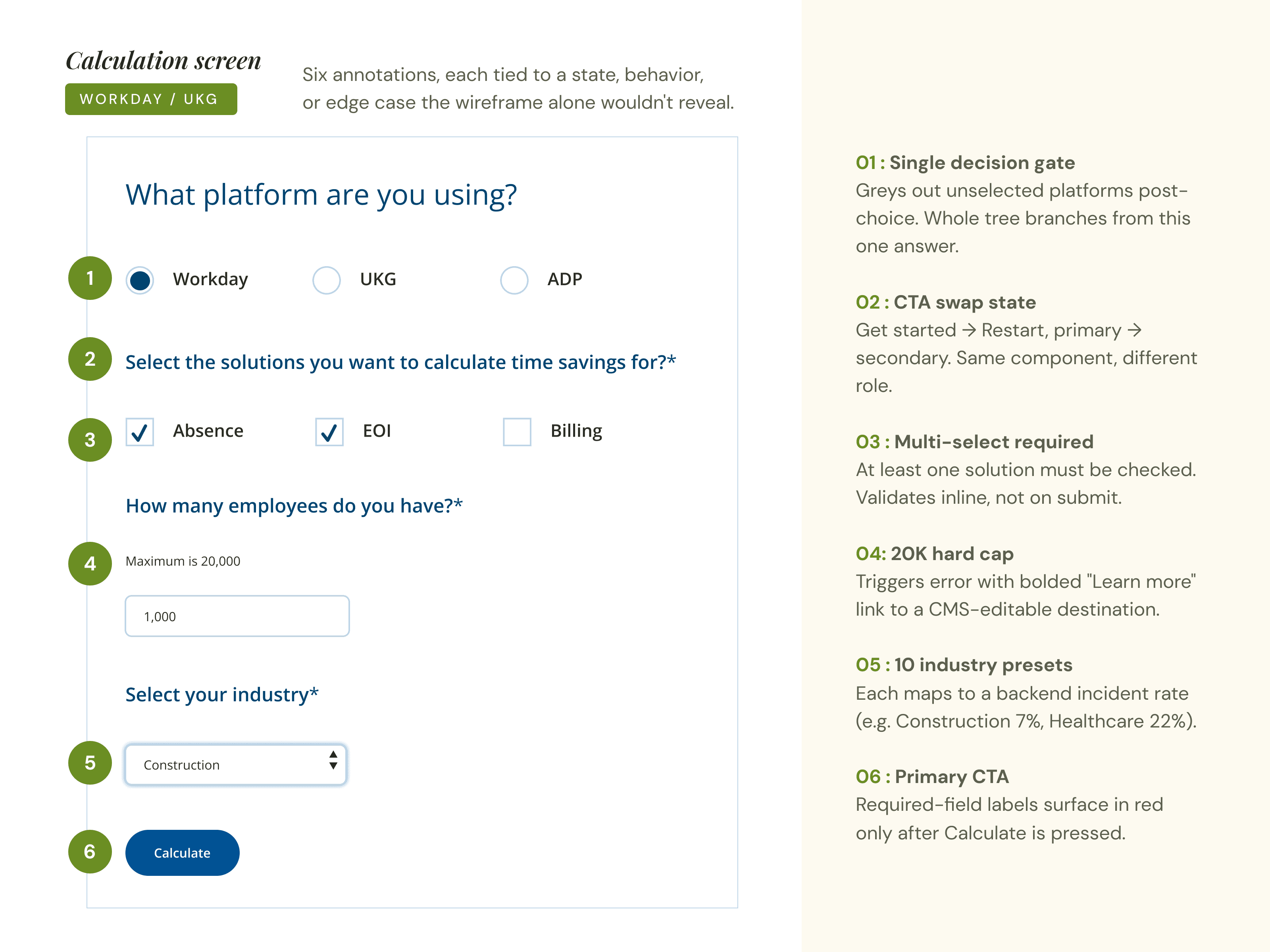
The wireframes weren't drawing the calculator. They were specifying every state, error, swap, and edge case before anyone built anything.
Before any pixel work, I drew every conditional state. The "Get started" button swapping to "Restart" once a platform was chosen. The required-field asterisk pattern. The error message that triggered when an employee count exceeded 20,000, with the bolded, hyperlinked "Learn more" pointing to a CMS-editable destination. The CTA on the result panel that needed to function as both a Sitecore page link and a dialog form trigger, depending on how marketing configured it.
These were the deliverable that unlocked the team. Engineering had a state map. Marketing knew exactly which fields were CMS-editable. Sales saw, on paper, that every input they cared about for lead capture was already accounted for in the Acoustic form behind the calculator.
- → Platform gate states (selected, disabled, post-selection greyed)
- → Required-field validation copy and inline placement
- → 20K employee error pattern with editable CMS link target
- → CTA swap behavior (Get started to Restart, primary to secondary)
- → Result panel CMS-editable fields and attribution slot
- → Mobile stack order and tablet break logic
Shipped to Sales as the standard prospect-facing tool for HR Connect.
Active across the HR Connect funnel in both gated lead-capture flows and ungated nurture pages. The post-launch UKG fix shipped on schedule and the architecture has held since.
Live in the HR Connect funnel
Deployed in both gated and ungated configurations across marketing-owned pages. The same component handles new-lead capture and existing-customer nurture without separate builds.
Post-launch metrics live with marketing
Conversion analytics, lead-quality scoring, and influence on closed-won deals sit with marketing operations and sales leadership. Ongoing measurement was outside design ownership.
Designing simplicity over hidden complexity.
A short retrospective on the three lessons I'd carry into the next product. Each one came from a specific decision in this project, two from what worked and one from what broke.
A calm UI is a series of structural choices.
The calculator only feels simple because the platform gate decides what to hide. Simplicity wasn't a styling decision, it was the architecture. A user filling out three fields never sees the eight other fields they'd see on another platform.
Annotate the invisible, not the obvious.
Errors, validation, CTA swaps, attribution fields, CMS-editable strings. The pieces nobody asks about until they break are the pieces designers are uniquely positioned to specify before development starts.
Every shared dependency is a future conversation.
UKG Billing taught me to ask, every time I unify two things, what would have to change for them to need to be separated again. Then design the seam now, not later. Sharing code is cheap. Decoupling under deadline pressure isn't.