Designing the system behind 26,290 registrations.
The Leave Briefing: a 6-episode educational webinar series for HR professionals. Five interconnected deliverables. One reusable system. The result of treating production scaffolding as a first-class design problem.
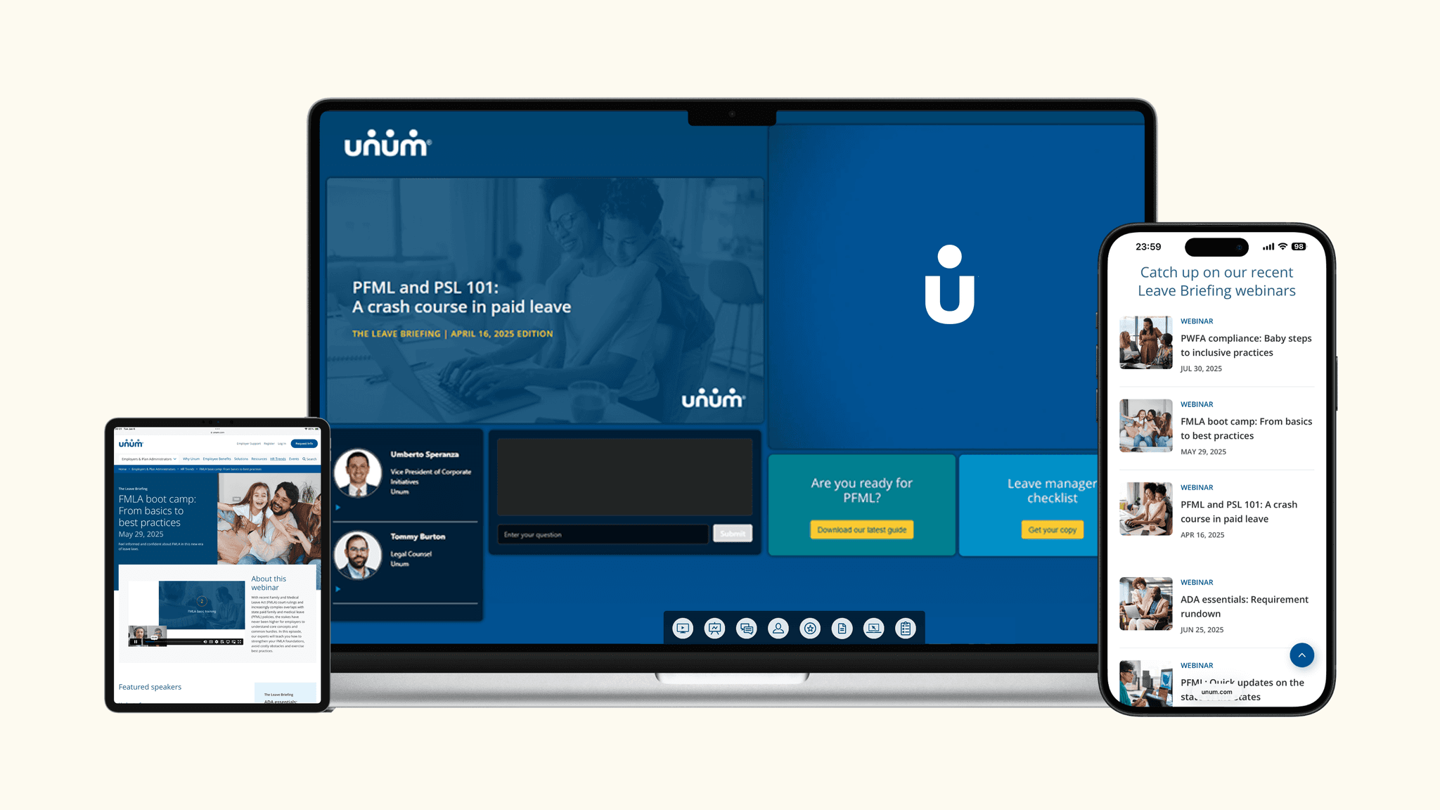
End-to-end experience
76% under 1,000 employees
Unum brand system
6 episodes, monthly cadence
Total registrants across the six-episode series.
Average attendance rate, series-wide. Consistent across all six episodes.
Live engagements: Q&A responses and CTA clicks during broadcast.
Of attendees rated the content "very useful" in post-event surveys.
Of registrants came via field invitation links, proving share-worthy design.
Not one audience. Four distinct segments.
86% of attendees were employers. But within that cohort, the design had to serve four meaningfully different user types, each arriving with different motivations, different levels of legal literacy, and different definitions of "useful."
HR professionals
Time-constrained, compliance-anxious, and responsible for decisions that affect their entire workforce. Design had to reduce cognitive load before the first slide appeared. Visual hierarchy was a compliance tool.
First-time attendees
Every episode brought 60-70% new registrants. The experience had to work as a standalone with no prior series context required. Episode design had to be self-contained without sacrificing series identity.
Brokers
Episode VI showed 20% of registrants matched to broker domains. This audience uses the content differently, as client advisory material rather than personal compliance guidance. Design for shareability and reference.
Repeat viewers (4+ episodes)
A core engaged segment building a knowledge base across the series. Episode numbering, visual consistency, and series identity design rewards and reinforces this behavior.
Five deliverables. One system. Six episodes without rebuilding.
A one-episode webinar is a project. A six-episode series with consistent branding, consistent audience experience, and consistent field execution is a product. Products require systems. I designed the system before the first episode launched, so every subsequent episode was an instance of the template, not a new design problem.
Slide Deck Template
A locked structural template with modular content zones. Speaker intros, agenda slides, content frames, and CTA slides were all pre-designed. Each episode required content insertion, not layout decisions.
Reduced per-episode design time. Ensured every episode felt like the same product.
Email Templates (Pre + Post)
Two email states sharing 70% of their structural DNA. Pre-event focused on urgency and registration. Post-event focused on replay access and next-episode seeding. Built as a system with two states, not two separate designs.
The shared structure meant improvements to one state improved both. Six episodes, zero template rebuilds.
On24 Console Design
The live broadcast environment. Resource widget placement, CTA timing, and speaker frame design were all deliberate. 8,549 live engagements didn't happen because the audience was engaged. They happened because the console design made engagement the path of least resistance.
Every CTA click and Q&A response is a designed interaction. 8,500+ of them.
Promotional Graphics
LinkedIn-native dimensions, headline-forward design, consistent episode branding. Adapted for both organic posts and field partner sharing.
Episode VI: 20% of registrants matched to broker domains. Share-worthy design enabled the field-to-broker pipeline.
Pre/Live/Post Journey Map
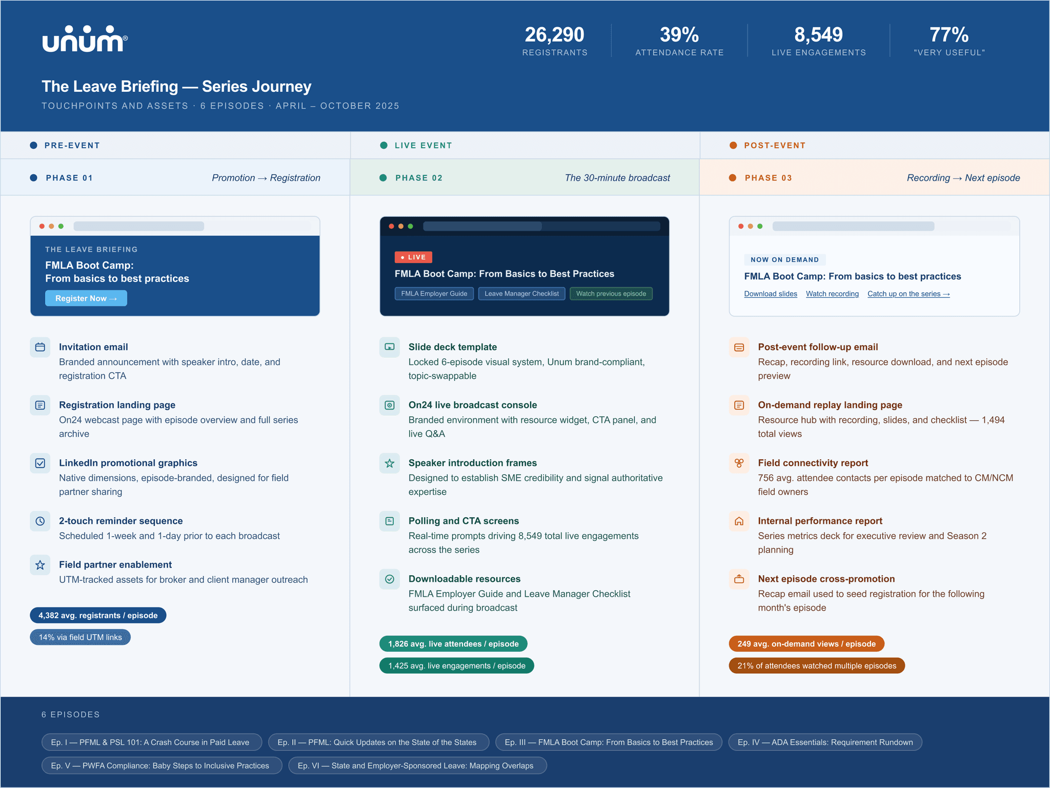
A research artifact that mapped every touchpoint across the three phases, identified gaps, and documented asset dependencies. The most strategic deliverable, not the most visible one.
Became the content team's production blueprint. Made the invisible visible.
Pre, live, post. Three phases. Three design problems.
A webinar isn't an event. It's a journey that starts with a promotional post and ends weeks later with a follow-up resource. Each phase has its own design rules, and the assets in each must connect to the assets before and after.
Pre-event
- Promotional graphics (LinkedIn + email)
- Landing page registration experience
- Pre-event email templates
- Field partner enablement assets
Live event
- Slide deck template (locked structure)
- Live Q&A visual prompts
- Speaker introduction frames
- Real-time polling and CTA screens
Post-event
- Post-event email templates
- On-demand replay landing pages
- Field connectivity assets
- Series recap & internal performance materials
Six episodes. Consistent attendance. Habitual engagement.
The most meaningful signal in this data isn't the total registrant count. It's the consistency of the attendance rate across all six episodes.
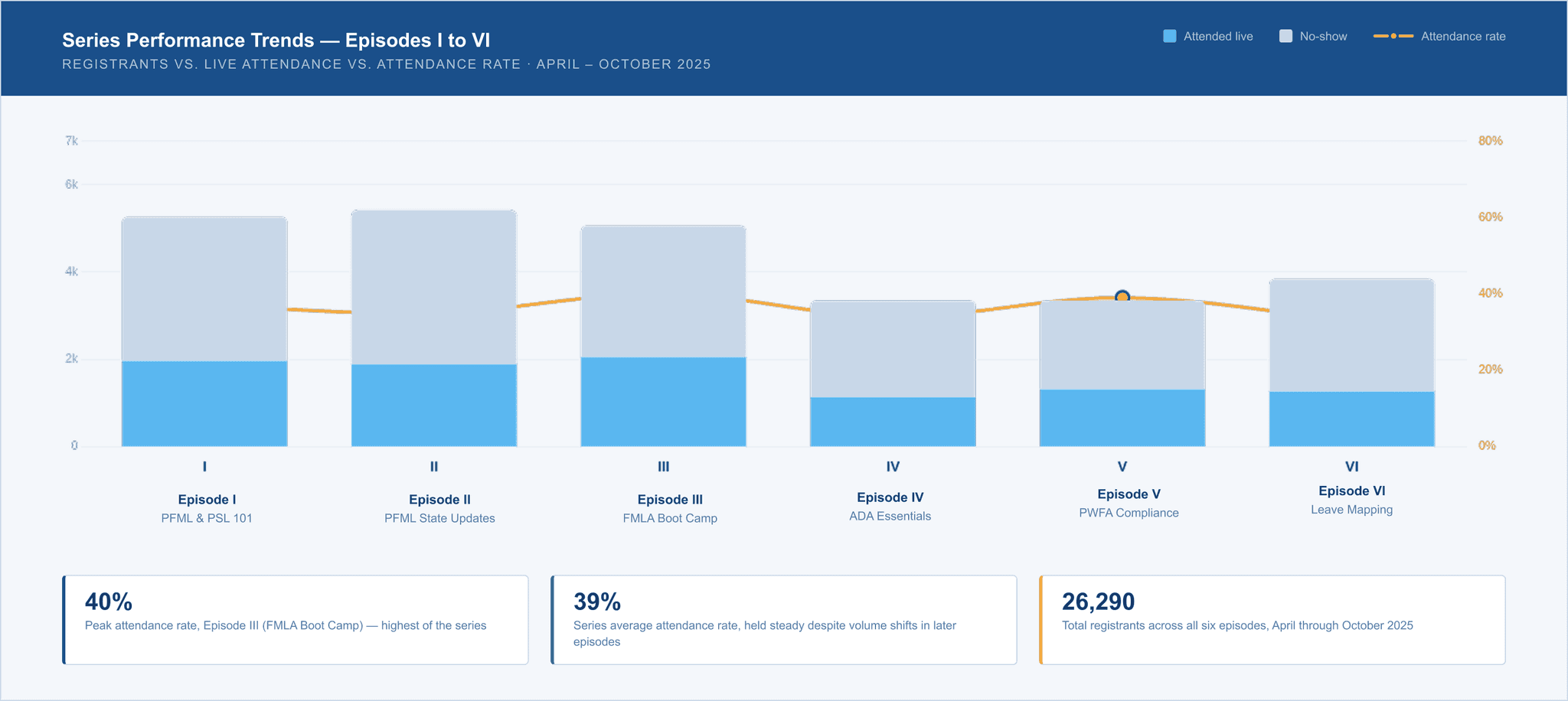
| Episode | Topic | Date | Registered | Attended | Rate |
|---|---|---|---|---|---|
| I | PFML and PSL 101: A crash course in paid leave | Apr 16, 2025 | 5,265 | 1,963 | 37% |
| II | PFML: Quick updates on the state of the states | Apr 30, 2025 | 5,423 | 1,886 | 35% |
| III | FMLA boot camp: From basics to best practices | May 29, 2025 | 5,063 | 2,048 | 40% |
| IV | ADA essentials: Requirement rundown | Jun 25, 2025 | 3,348 | 1,132 | 34% |
| V | PWFA compliance: Baby steps to inclusive practices | Jul 30, 2025 | 3,350 | 1,312 | 39% |
| VI | State and employer-sponsored leave: Mapping overlaps | Oct 1, 2025 | 3,841 | 1,262 | 33% |
What Season 2 would look like.
The pilot was successful. The data also revealed exactly where the next iteration should go.
Design a Series Dashboard for repeat viewers.
21% of attendees watched multiple sessions. That cohort deserved a designed experience for tracking their progress across the series, not just individual episode replay pages. A Series Dashboard with episode completion states and content recommendations would gamify repeat engagement.
Build audience-specific entry points from the start.
HR professionals and brokers arrive with different motivations. A segmented registration flow and tailored confirmation experience would improve relevance from the first touchpoint. Audience-specific entry points need to be designed in from the start.
Create a series-level visual arc, not just episode-level identity.
A visual arc across all 6 episodes (progressive color treatment, episode numbering, a series completion graphic) would reward repeat viewers and signal the series as a product, not a collection of events. The 21% repeat-viewer cohort deserved visual recognition for their persistence.