From scattered PDFs to a single source of truth.
A four-month migration from static PDFs and Adobe XD files into a robust, component-based, token-driven library in Figma. The hardest part was not the tooling. It was the people.
Design system contributor
1 Developer · 1 PM
Migrated from Adobe XD
2022 to 2023
A 175-year-old company, legacy tooling, and no shared vocabulary.
"Where is the latest logo?" was a Slack message we got every week.
Our design assets were decentralized.
Updates made to the "master PDF" didn't automatically propagate to working files in Adobe XD. Designers and developers were working from sources of truth that drifted further apart every week.
Designers were reinventing the wheel.
- Common elements like buttons and cards were rebuilt every time.
- Developer handoff was messy because XD specs were manual.
- We lacked a shared vocabulary between design and code.
Inconsistencies were plaguing our product.
Simple updates took days because changes had to be made in twenty places. The system had become a bottleneck against shipping the work.
Not just a tooling change. A culture change.
Create a dynamic, living library in Figma that uses modern features (Auto Layout, Variants, Variables) to speed up workflow and ensure 100% consistency.
But the real goal was harder. We needed designers, developers, and stakeholders all working from the same source of truth. We needed them to actually want to use it.
We didn't copy-paste. We restructured.
I adopted Brad Frost's Atomic Design methodology to ensure the system was scalable. The principle: complex interfaces are built from small, reusable parts. If those parts are designed as a system, the whole system stays consistent as it grows.
Atoms
Tokenized the basics: color styles, typography ramp, grid systems, spacing, and vertical rhythm. WCAG accessibility standards validated during the color audit.
Molecules
Combining atoms into functional interactive elements: buttons with all states, input fields, form controls. Built with Variants and Auto Layout.
Organisms
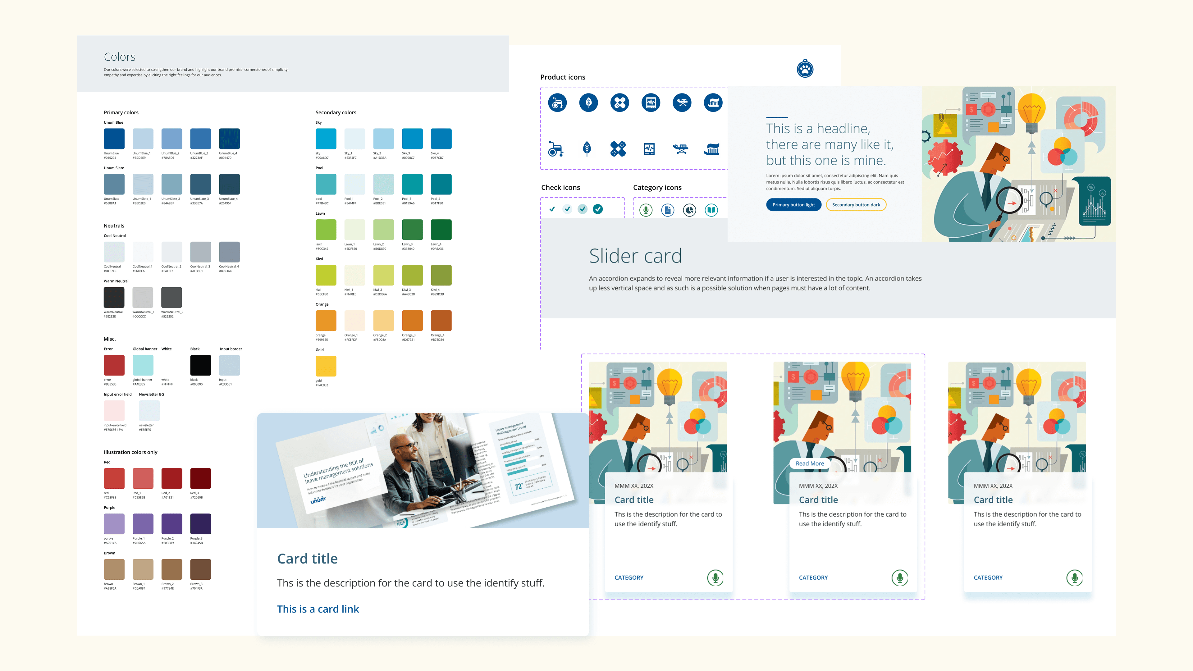
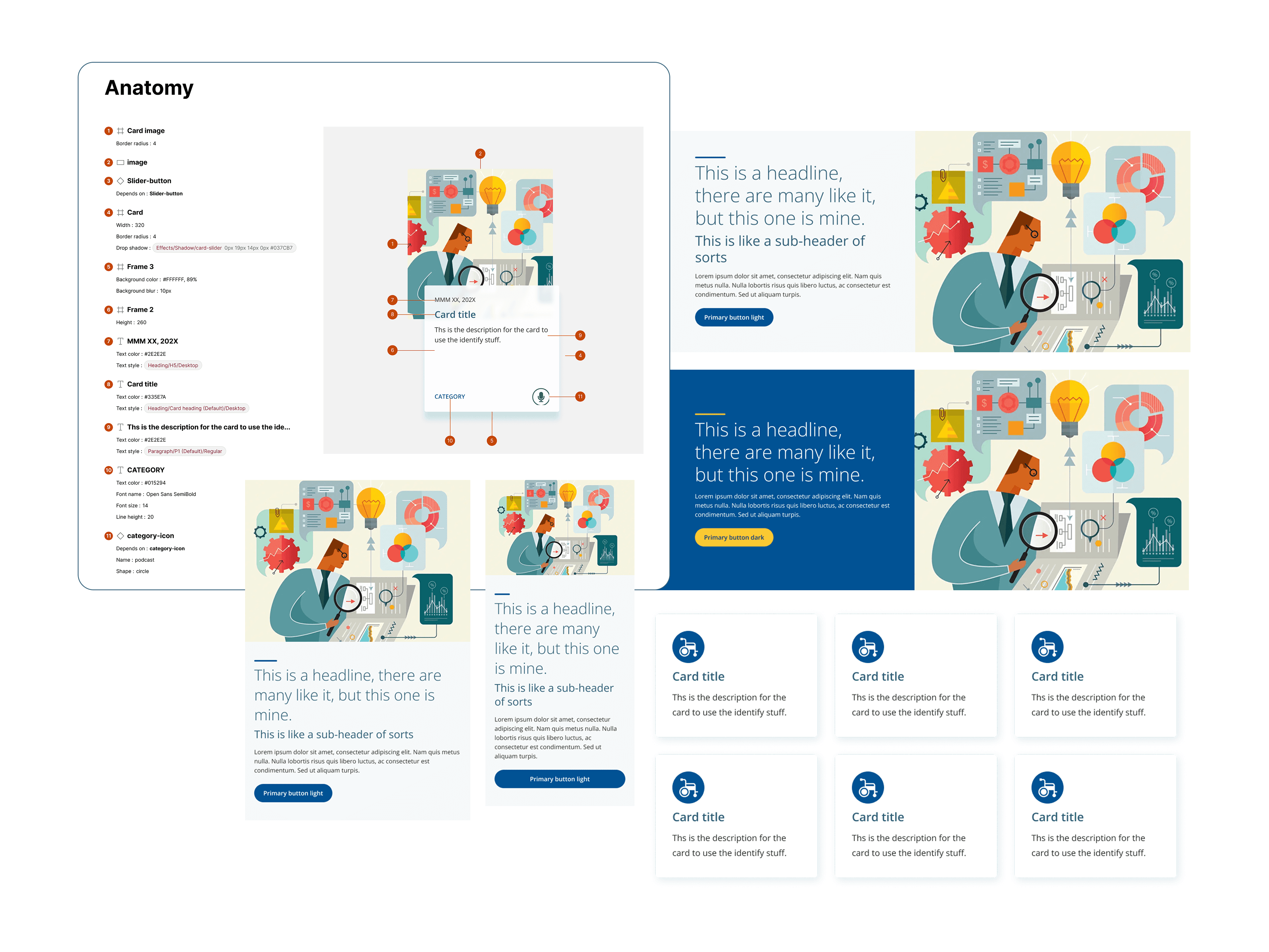
Assembling complex UI patterns: Audience Page Banners, Global Alert Banners, Card Decks, Content Image Banners. Full sections of the product, each composed from the same atomic building blocks.
Foundations as tokens.
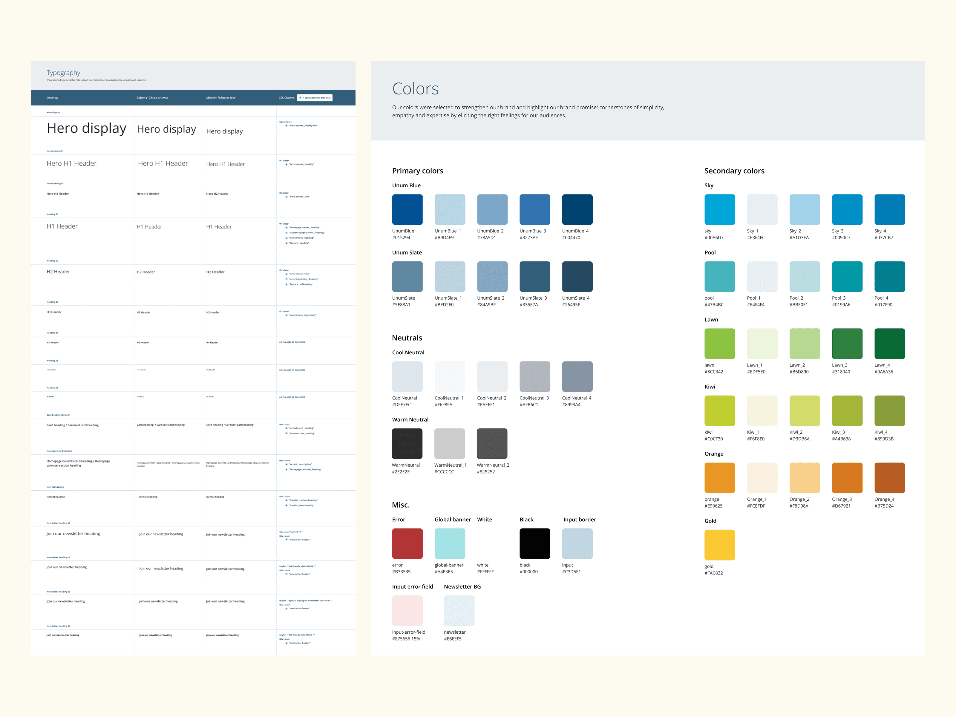
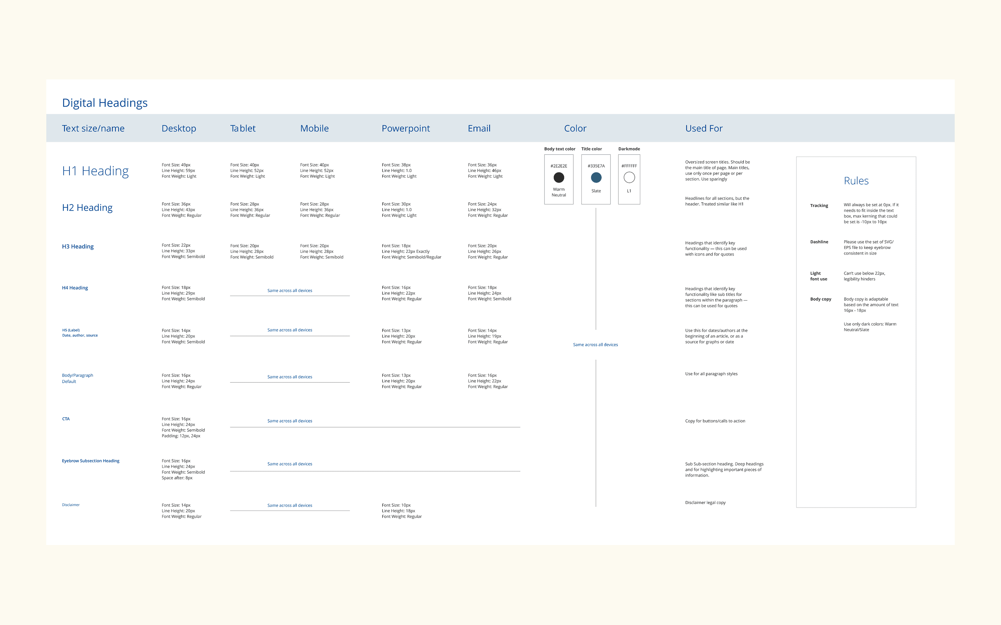
The first move was tokenizing every visual primitive. Color became a token library, every shade documented, named, and tied to accessibility ratings. Typography became a ramp with defined sizes, line-heights, and use cases across desktop, tablet, mobile, PowerPoint, and email.
This was the unsexy foundational work, but it's what makes everything else above it stay consistent. A brand color update now propagates across the entire system automatically. No more "which Unum blue is the right blue?"
Every token, WCAG validated.
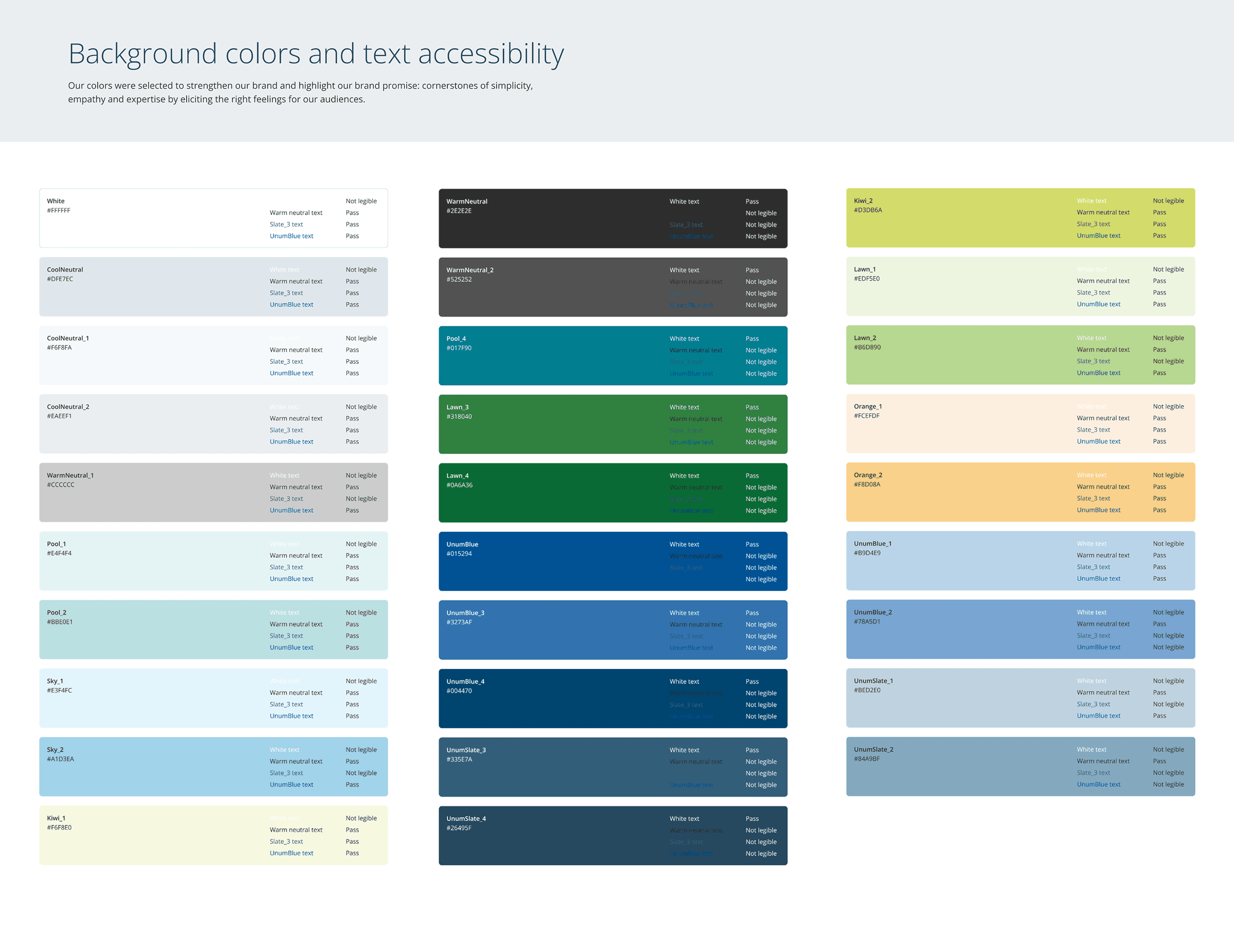
Accessibility was not a checklist at the end. As I built the color token library, I validated every contrast pairing against WCAG 2.1 AA. I documented which combinations pass for body text, which pass for large text, and which fail entirely.
For a regulated industry, accessibility isn't optional. It's a legal requirement. Encoding it into the tokens themselves means designers downstream can't accidentally ship something non-compliant.
Components with variants.
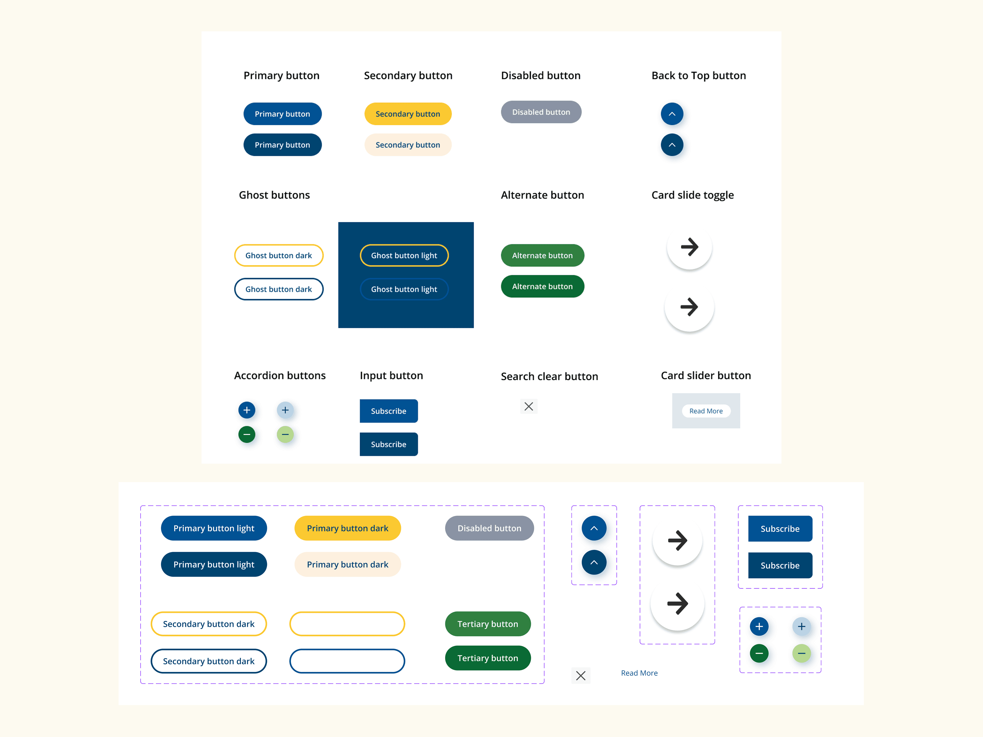
The button system is the one I'm proudest of. The old system had multiple button styles floating around product teams with no clear rules for when to use which. I consolidated them into a single component with variants for hierarchy (primary, secondary, tertiary), state (default, hover, focus, disabled), and size, all tied to color and spacing tokens.
Auto Layout meant the button resized cleanly with any label. After rollout, the dev team told me they cut button-related tickets significantly because the implementation rules were unambiguous.
Composed UI patterns.
With atoms and molecules in place, organisms were the payoff. Audience Page Banners, Global Alert Banners, Card Decks, Content Image Banners. Full sections of the product, each composed from the same atomic building blocks.
Every organism was documented inside Figma with usage notes. Do's and Don'ts written into the component descriptions themselves. The system wasn't just files. It was instructions on how to use them.
From scattered PDFs to a single source of truth.
The migration from Adobe XD wasn't a 1:1 transfer. It required rebuilding components using Figma's modern features, Auto Layout, Variants, and Variables, to ensure the system was responsive, scalable, and maintainable.
A static PDF brand guideline plus working Adobe XD files that drifted out of sync. Designers reinvented the wheel. Developer handoff required manual specs. Updates didn't propagate.
A living Figma library with tokens, variants, and Auto Layout. Documentation lives inside the component. Naming matches the code repo. Updates propagate everywhere, automatically.
Measurable shifts in how the team worked.
Beyond the new files: faster shipping, cleaner handoffs, and a shared language between design and engineering that didn't exist before.
Speed to market.
Prototyping new screens became significantly faster. What used to take hours in XD now took minutes by dragging and dropping pre-made Figma components.
Single source of truth.
We eliminated the "where is the latest logo?" Slack messages. Everyone, designers, devs, and marketing, knew exactly where to look.
Developer parity.
By naming Figma components to match the code repo (standardizing "Hero Banner" or "Icon List"), we reduced confusion during handoff and shared a common vocabulary.
Adoption beyond me.
Junior designers were upskilled to use the system independently. The team shifted from resistant to actively requesting new components.
What this taught me about systems work.
The technical lessons matter, but the cultural ones matter more. They're the ones I'd carry forward into any design systems team.
Governance is the hard part.
Building the system is the easy part. Maintaining it is hard. We needed a clear process for who is allowed to change a component or add a new one. Without it, the system fragments fast.
"A library nobody uses correctly doesn't serve the team."
Tools shape culture.
Switching to Figma unlocked collaboration features Adobe XD didn't provide at the time: multiplayer editing, inline comments, dev mode. The tool change literally changed how we worked together.
"The tool is not the system. But the right tool makes the system possible."
Adoption is not creation.
Half the job of leading a design system is education and evangelism. Working sessions, 1:1s, async support. I treated system adoption as part of my job, not just system creation.
"Path of least resistance is the path adoption follows."