Design that made 24,000+ HR professionals stop scrolling.
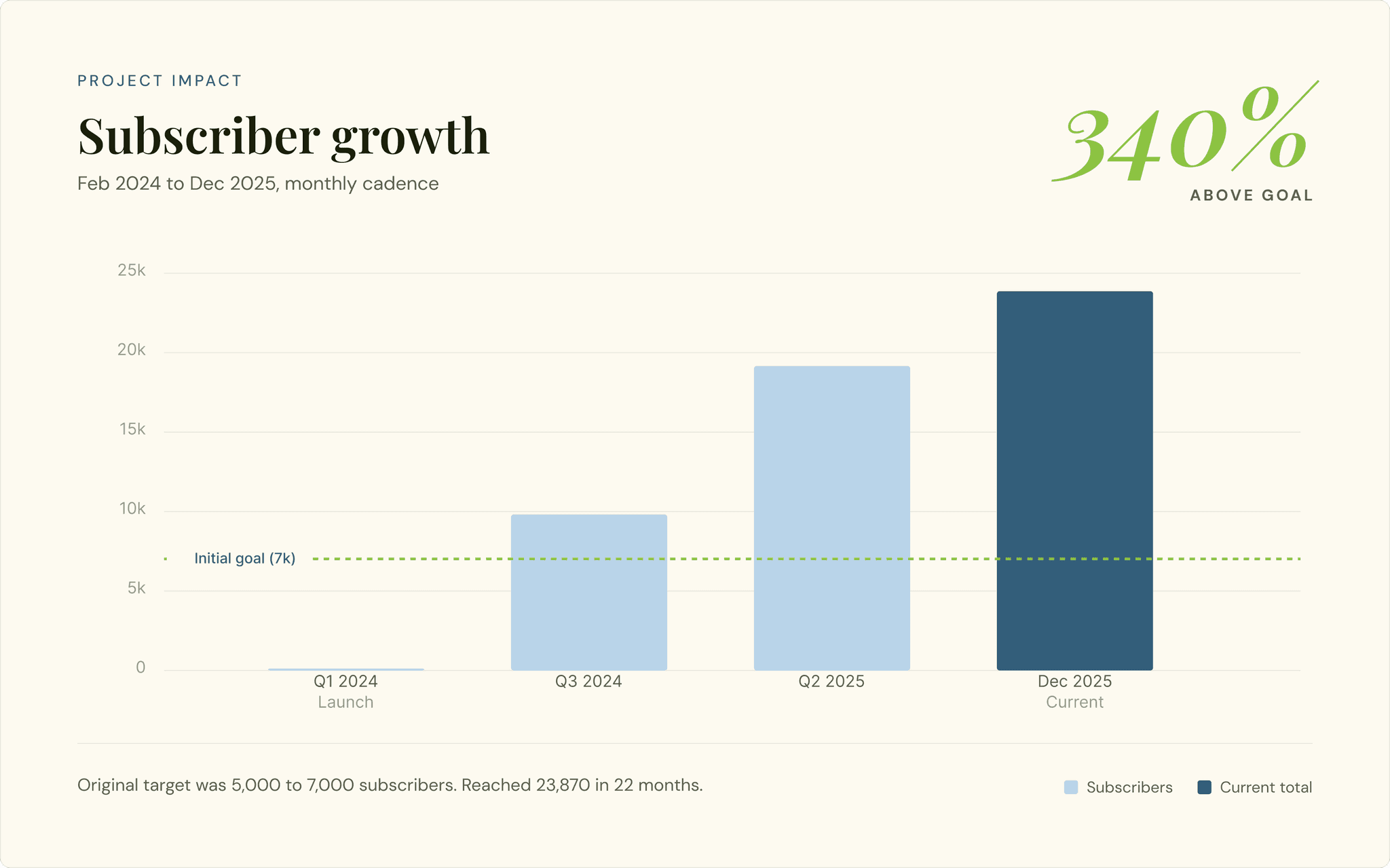
The Benefits Briefing: a monthly LinkedIn newsletter that scaled from zero to 24,000+ subscribers in two years. 3.4× the original goal. By treating visual hierarchy as a growth lever.
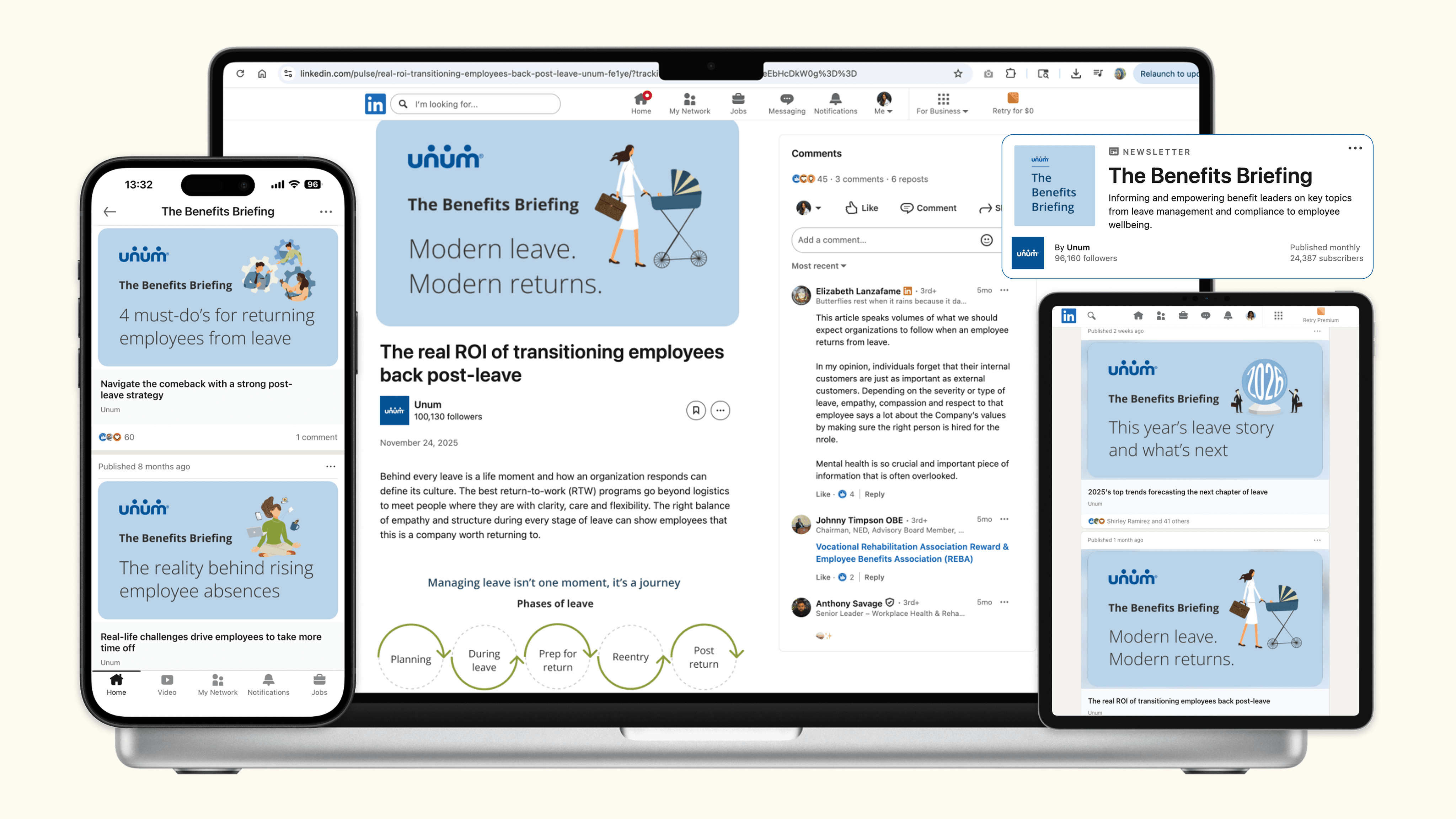
Newsletter template & cover
Designer, copywriter, owner, PM
Unum brand system
Monthly cadence
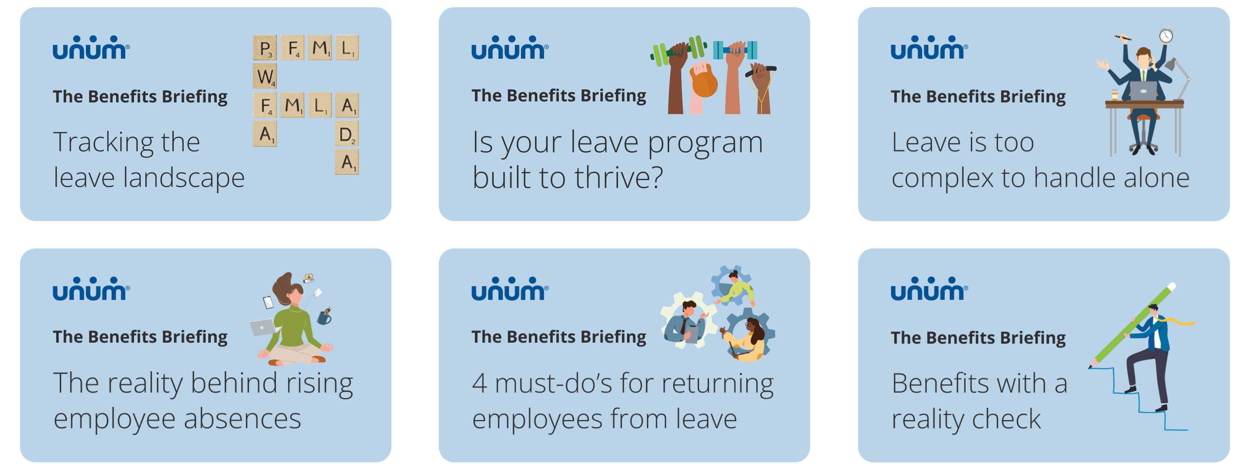
Six covers. One visual system. Twenty-two months.
Each issue is recognizable as a Benefits Briefing before the headline is read. Visual identity compounds: by issue six, brand recognition was doing the conversion work.
From a single directive, a product.
In Fall 2023, Unum's Client Advisory Council gave the content team a single directive. It was a content brief, but it was also a design brief hiding in plain sight.
"We need quick, useful HR content. Easy to find. Easy to read."
— Unum Client Advisory Council, Fall 2023
Through the Council, we'd learned HR professionals were overwhelmed. The existing landscape of compliance content was dry, dense, and intimidating. Easy to read is a typography decision. Easy to find is a layout decision.
The Benefits Briefing succeeded not because the content was relevant, but because the design made that relevance immediately visible.
Means scannable. Design must support reading in 60 seconds or less.
Topic relevance must be legible before the reader commits to opening.
Means discoverable. Design must earn shares and saves, not just opens.
Means clear typographic hierarchy. Remove friction between reader and content.
One newsletter. Four reader types. One visual system.
The Benefits Briefing serves HR professionals across a wide spectrum of seniority, company size, and industry. Designing one visual system for all of them required understanding the reading context at each level.
The HR Executive
VP or CHRO. Scans cover and headline only. Opens if headline maps to a board-level concern. Shares if it makes them look informed.
Cover must lead with the business implication, not the technical detail. Headline drives open rate.
The HR Specialist
Benefits admin or compliance manager. Reads the full article. Returns to past issues. Most likely to subscribe via direct share from a colleague.
Template must make content easy to navigate: section breaks, clear subheads, readable body copy.
The Field Partner
Unum account manager. An unexpected power user discovered post-launch. Screenshots covers for LinkedIn posts. Uses it as a trust-building tool with clients.
Cover must be shareable as a standalone image. Visually strong at small sizes. Headline readable in a screenshot.
The Broker
Third-party benefits broker advising client companies. Subscribes to stay current. Forwards useful issues to their own clients as value-adds.
Content must feel authoritative enough to forward. Brand trust and visual polish matter for secondhand use.
Complex topics. Small canvas. High bar.
Designing for LinkedIn means designing for the thumbnail, before you design for the reader.
Regulations that don't want to be read.
Topics like Paid Family and Medical Leave (PFML) and the Pregnant Workers Fairness Act are inherently complex. The design needed to reduce the cognitive load required to understand these regulations, not just present them.
Designing for the thumbnail.
Designing for LinkedIn meant working within strict dimension constraints where visuals had to be legible on mobile devices, as thumbnails, before they were ever clicked.
Subjective feedback, objective standards.
Our project sponsor held exceptionally high standards for visual precision and brand voice. This required me to develop a workflow centered on rapid iteration and high-fidelity prototyping. I had to learn to interpret subjective feedback and translate it into objective design improvements to move the project forward efficiently.
A template that works every month. For any topic.
The Benefits Briefing covers topics that are wildly different in tone. PFML legislation, enrollment strategy, leave program design, maternal health law. A strong template system makes all of them feel like they belong to the same publication, without making them look identical.
Scannable first.
HR professionals open email on mobile between meetings. The cover image and headline must convey the topic's value in under 3 seconds. If it requires reading to understand, the design has already failed.
Authoritative, not academic.
The audience trusts Unum as a subject-matter authority. The design must reinforce that credibility. Professional without being corporate-cold, clear without being simplistic.
Consistent as a brand signal.
Monthly consistency across all issues is itself a design deliverable. A subscriber who sees any Benefits Briefing cover anywhere should recognize it immediately. Visual identity builds trust over time.
Illustration over photography.
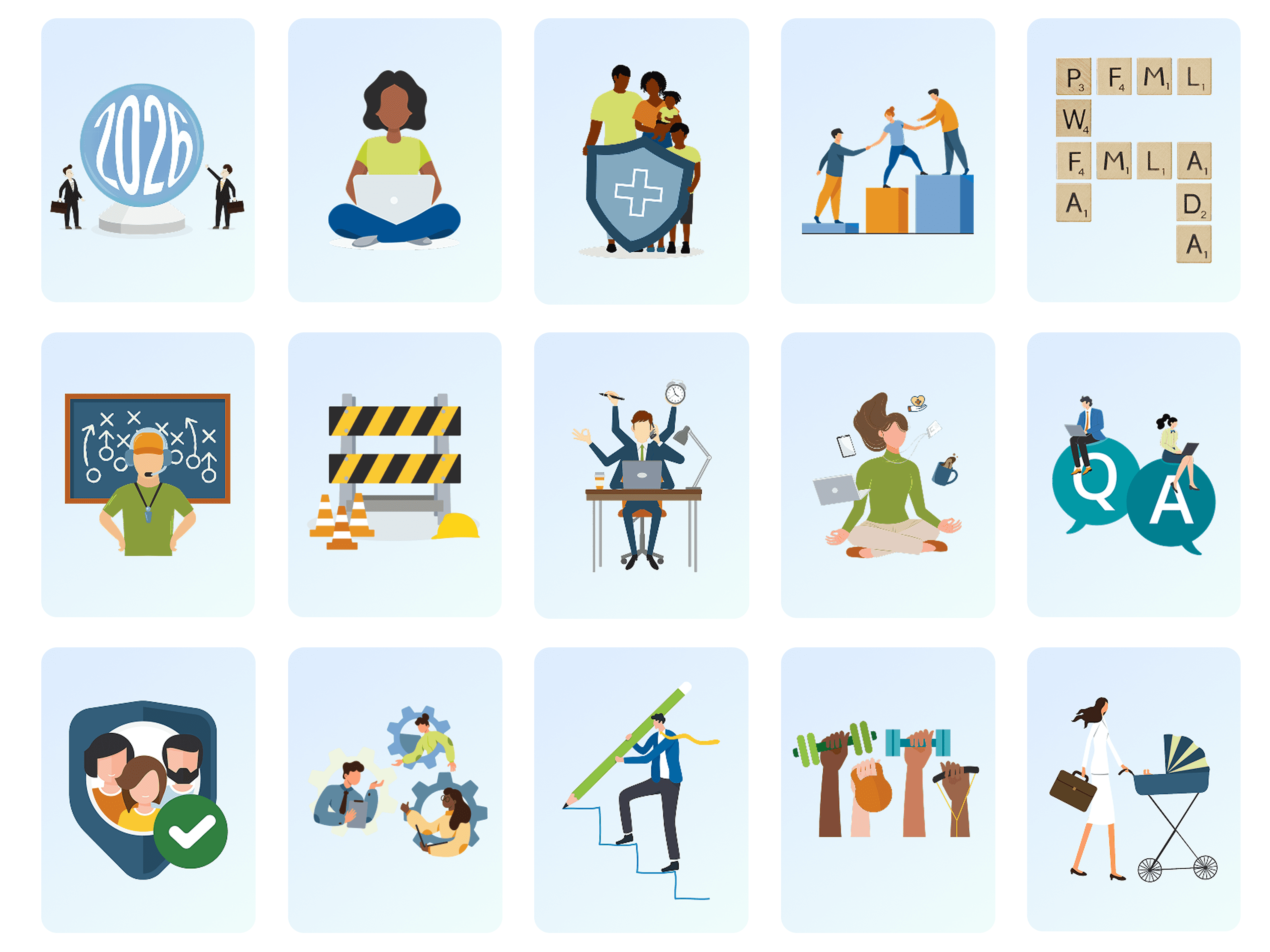
We moved away from stock photography and developed a custom illustration style. I utilized a visual language that felt supportive and human. I incorporated organic shapes and diverse character illustrations to humanize HR tech and lead with heart.
Using Unum's existing brand illustration library rather than stock photography made each cover feel distinct and not generic. It also meant zero licensing constraints on any issue.
A scannable dashboard, not a wall of text.
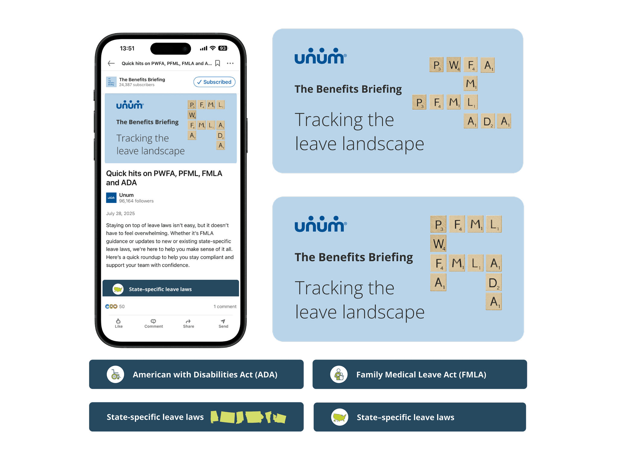
To handle the variable nature of state-specific laws, one of the most dense content types in the newsletter, I created a scalable card system.
For updates like "State of the States: DE, ME, MD, MN," I designed a typographic hierarchy that allowed users to scan for their specific location instantly. This turned what would have been a wall of text into a scannable dashboard. Readers filter information visually before committing to reading.
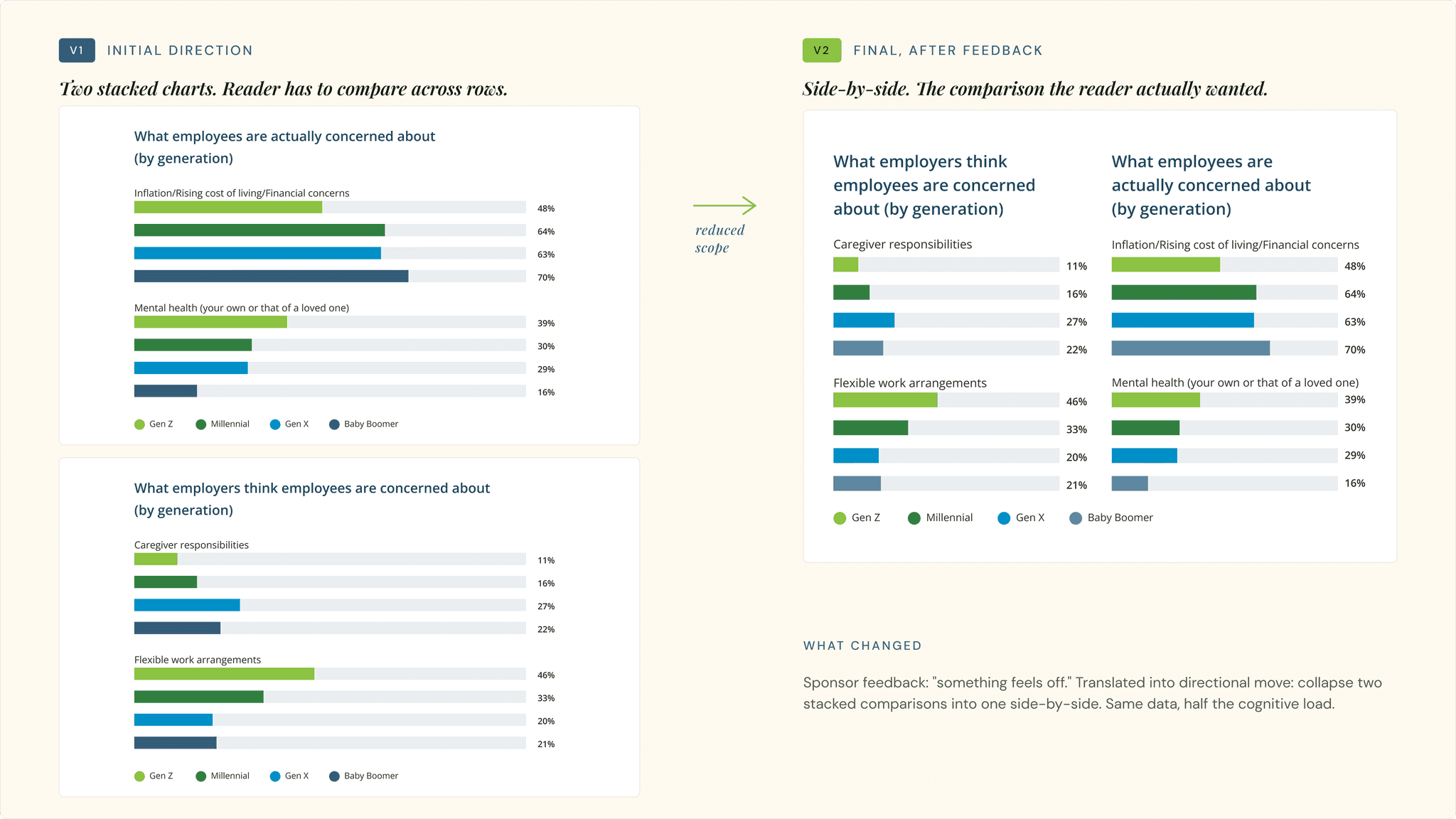
Turning "something feels off" into directional feedback.
Our project sponsor knew what she wanted but had a hard time articulating it. Feedback would come back as "I don't love this" or "something feels off." Directionally unclear, but emotionally strong. Rather than guessing and iterating in circles, I developed a two-part workflow that turned subjective reactions into decisions I could act on.
Ground it in data.
I brought subscriber engagement data and user research into every review, so we could evaluate designs against actual reader response rather than personal preference.
Live-prototype the options.
I walked her through two or three directional variants in real time, asking which one got her closer to what she was envisioning. That unlocked her, and she started giving me specific, directional feedback I could act on.
3.4× the goal. Year one.
The visual strategy contributed to growth that vastly exceeded our initial targets, validating that B2B audiences crave well-designed, digestible content.
Readers in the first 24 hours of every issue, held consistently, proving habitual brand engagement.
Total ecosystem engagements in 2024 across the Briefing, email, social, and HR Trends website.
Three things this project taught me about designing for reach.
Lessons that apply to any design work where the goal is reach, repeat engagement, or reducing cognitive load for a busy audience.
Headline-first visual hierarchy wins.
Leading with the article title in large, bold type on the cover image meant readers understood the value proposition before opening. Open rates rewarded this consistently across all issues.
"If it requires reading to understand, the design has already failed."
Consistency is the growth lever.
By issue six, the design was recognizable enough that subscribers engaged before reading the headline. Brand recognition was doing the conversion work. Visual identity compounds.
"Monthly consistency across issues is itself a design deliverable."
Reduced cognitive load equals retention.
By shifting from dense text to a scannable, visual-first content strategy, we didn't just meet our subscriber goals. We shattered them. In B2B compliance, reduced cognitive load directly correlates to increased user retention.
"B2B audiences crave well-designed, digestible content."