Five themes. One audience. Twenty-one days of data.
Designing a Sleep/Focus YouTube product from scratch, with no audience and no budget, by treating every visual theme as a product SKU under continuous live A/B testing.
21 consecutive days
Plus broadcast operator
YouTube Analytics on the back end
Live audience as research input
New entrants can't win by guessing. They win by iterating faster.
The Sleep/Focus content category is dominated by channels with millions of subscribers. Breaking in requires more than good content. It requires a research protocol.
I started this project with one assumption I refused to trust: that good Sleep/Focus content alone would find an audience. Established channels in this category have spent years training viewers on a specific aesthetic. As a new entrant with no audience, no budget, and three weeks, I couldn't afford to spend a hundred hours producing the wrong content before the algorithm gave me usable signal.
So I designed the channel as a live product instead. Each visual theme was a product SKU with a performance hypothesis attached. The audience was the research panel. YouTube Analytics was the test infrastructure. The plan was to run them all in parallel and let the data say which ones to scale, which to pivot, and which to retire.
Which visual and temporal triggers actually induce deep sleep or deep focus, and can I identify them before committing real production resources?
The discipline of the sprint was answering that question with evidence, not opinion. The constraint was 21 days.
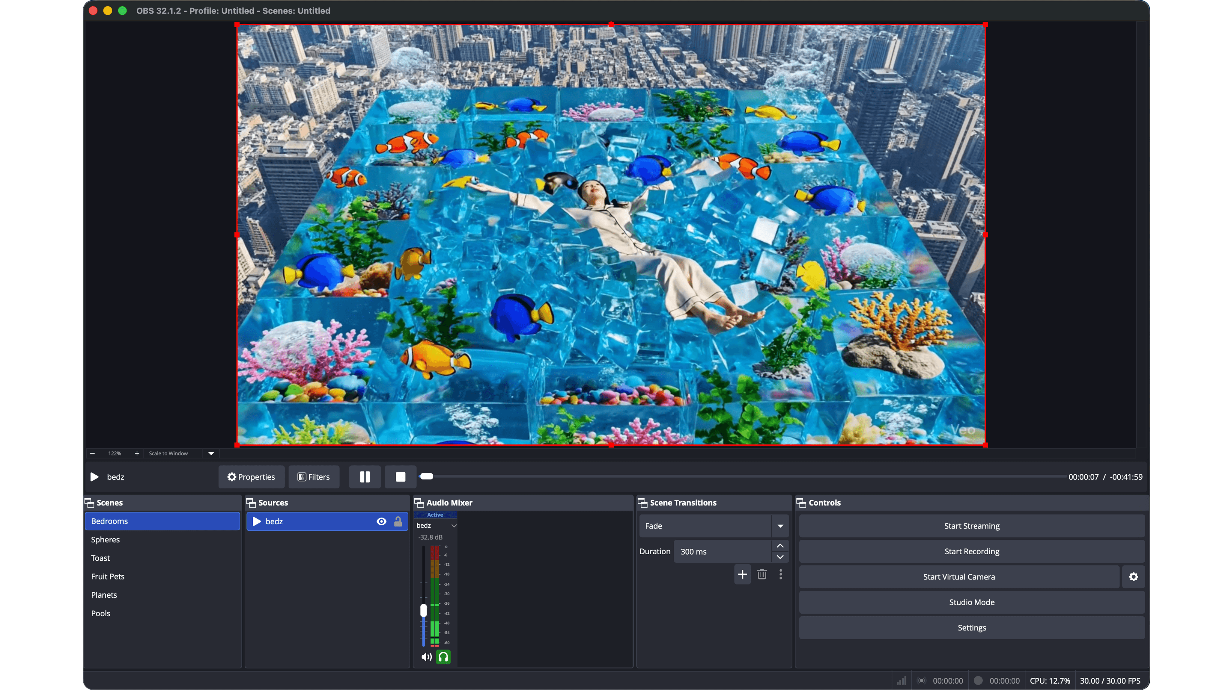
Five hypotheses. Five thumbnails. One uniform shelf.
Before any stream went live, I committed to five distinct visual hypotheses and standardized everything else (duration, metadata, cadence) so the thumbnail aesthetic was the only variable in motion.
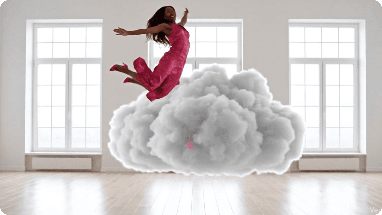
Clouds
Dreamy, surreal, soft. Bet: the sleep audience wants escape, not realism.
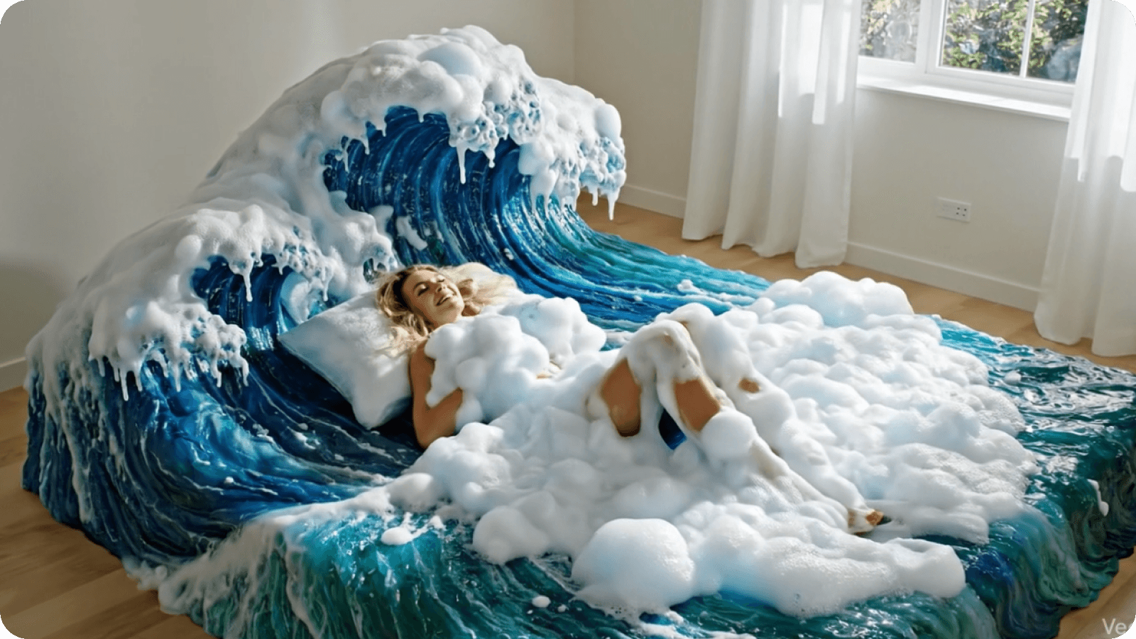
Bedroom
Cozy, realistic, dark. Bet: viewers want a space they can imagine being in.
Cushions
Abstract, soft textures. Bet: minimalism reads as restful at first glance.
Pools
Bright blue, aquatic, high-contrast. Bet: bold visuals win the click.
Fruit Pets
Surreal novelty. Bet: shock value drives clicks and held attention.



Live testing produces noisy data unless you design the controls first.
Five protocols I locked in before any stream went live. Each one isolates a specific source of measurement noise. None of them are exciting. All of them are why the data was usable at the end.
CTR and AVD pull in opposite directions.
Plotted on two axes, the five themes told a clearer story than any single metric could. Where each one landed determined whether it scaled, got repackaged, became a niche product, or got retired.
A high CTR with near-zero AVD isn't a conversion problem. It's a product truth problem.
The bright aquatic thumbnail signaled "Daytime/Energy" to users arriving with a "Sleep" mental model. The promise didn't match the product. The fix wasn't better marketing. It was retiring the asset entirely. This is functionally identical to a UI driving clicks to a feature that doesn't work as expected.
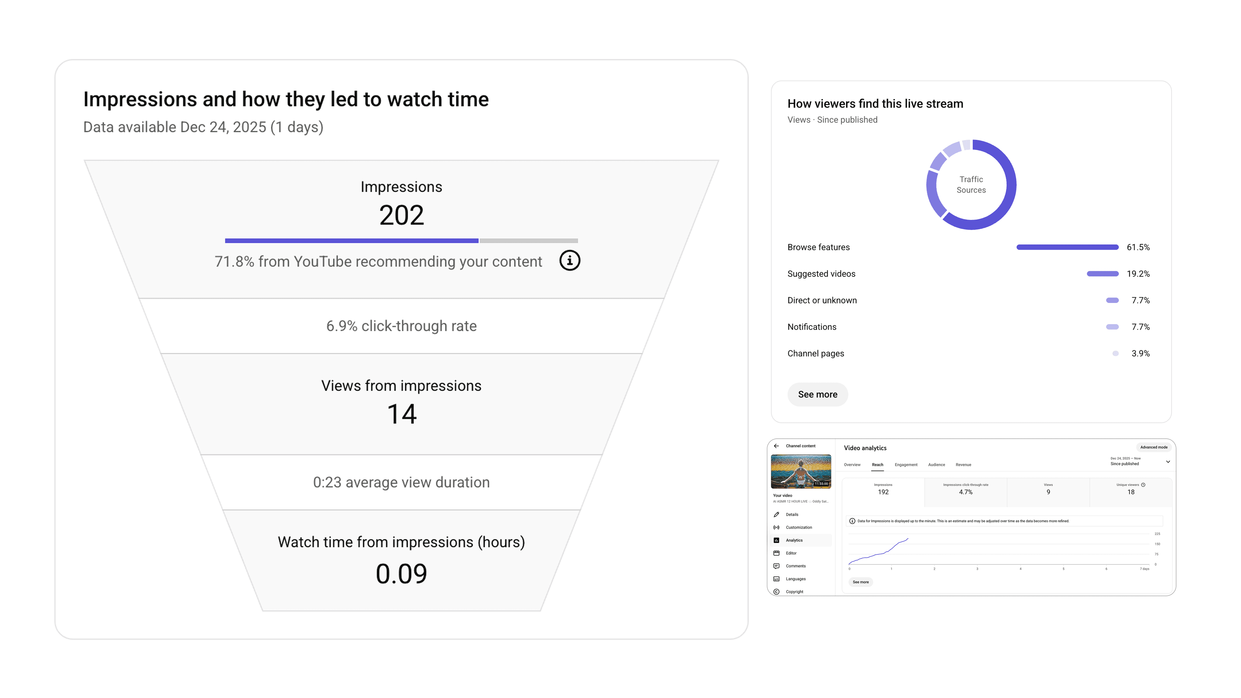
The lowest CTR theme produced the highest retention.
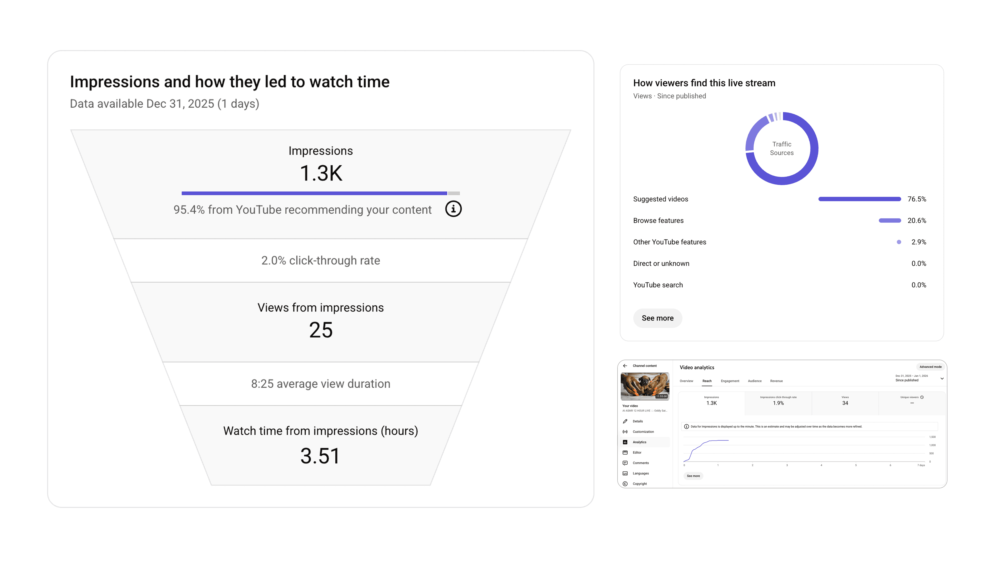
Fruit Pets attracted a narrow audience but held them eight times longer than the retired theme. A different product for a different moment, kept as a niche SKU rather than a flagship.
Lessons that travel past this project.
Read the full signal, not the loudest one.
CTR and AVD pull in opposite directions. Optimizing for one masks failures in the other. Pools had the best CTR in the entire test and still got retired. The metric that looks strong in isolation is sometimes the one hiding the failure.
Earn your pivots.
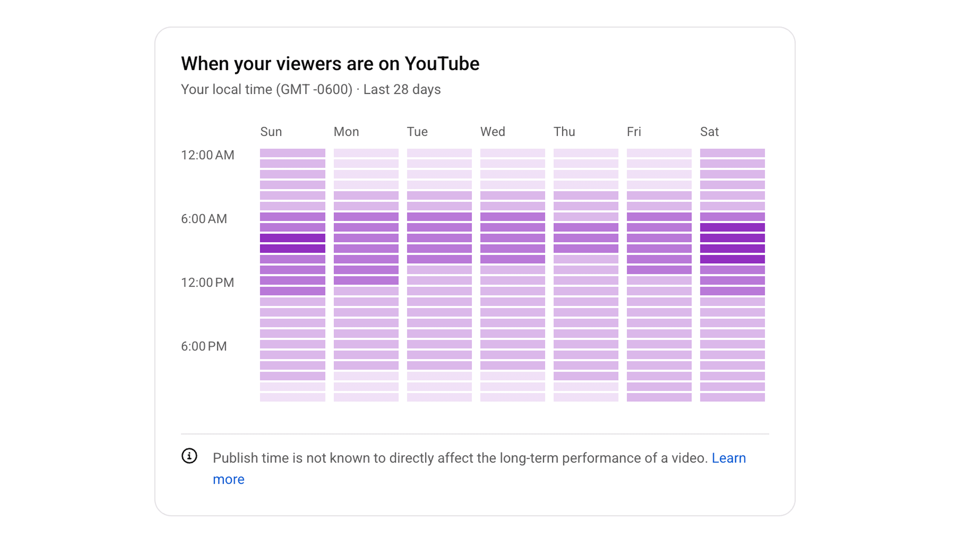
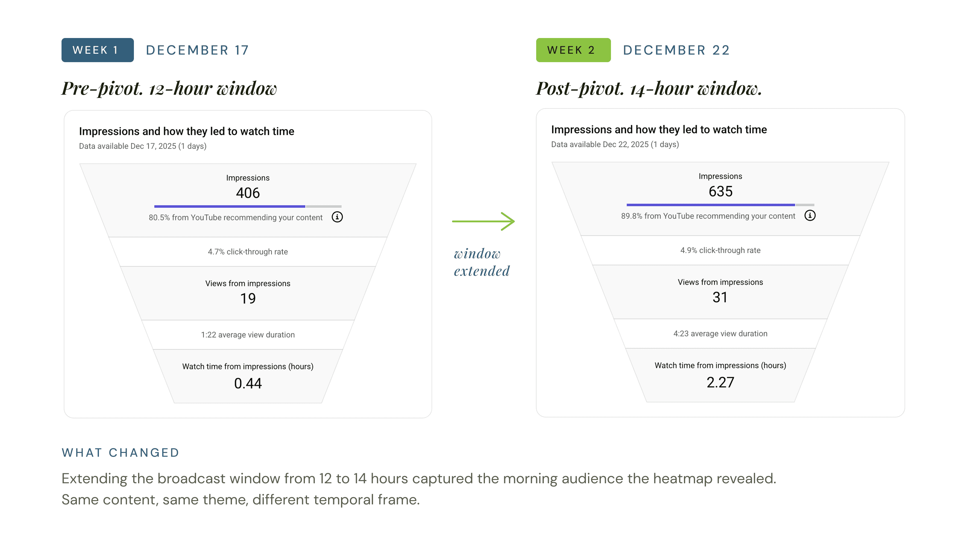
The Morning Shift wasn't a guess or a panic move. It was a response to a specific, unexpected pattern in the data. Data-driven pivots look completely different from anxiety-driven ones. The difference is whether you can name the signal that triggered it.
Retiring is a design act.
Killing Pools and deprioritizing Cushions freed capacity and sharpened the channel's identity. The hardest product decisions aren't about what to build. They're about what to stop. Having the data made killing the darlings a strategic act, not an emotional one.
The honest retrospective.
Three gaps I noticed on the other side of the sprint. Each one is a hypothesis I'd build into the next round.
Run qualitative research alongside the numbers.
The data told me what users did. I never spoke to a single user to understand why. A 5-person interview at the end of Week 1 could have surfaced the Morning Focus user a full week earlier than the heatmap did.
Test thumbnail redesigns before retiring an asset.
Cushions had strong retention but weak CTR, a clear repackaging signal I deprioritized for time. In a longer sprint, that's a hypothesis worth a real round of A/B testing rather than a retirement decision.
Track subscriber attribution by theme.
I know which themes drove impressions and which drove retention. I don't know which themes converted impressions into subscribers. That data would have sharpened the rotation decisions in Week 3.